thenumerateninny.com
Natterings of a Woman in STEM
Cover Conundrum

Indie authors who ignore warnings about the importance of book covers do so at their peril. But, not every writer has an artistic eye, and those few who do, do not necessarily understand what makes a book sell.
Having a myopic eye for art, I definitely rely on the skills of others when it comes to designing promotional materials. However, I have also been listening to what successful indie authors say about the topic. They believe in trying a variety of book covers to determine which one drives click-through rates (an essential metric in advertising campaigns).
As a result of my research, a few key points burrowed their way into my obtuse brain:
- The design should be consistent with other books in the genre.
- The type font should also be consistent with the readers’ expectations for the genre.
- The font color is key – brighter often being better.
- Generally, human figures should be central in the image.
- The background should draw the eye to the center of the image or to the human figure.
- The design should remain intelligible, even when viewed as a thumbnail.
- For book series, all book covers should have a consistent design theme and consistency in color.
- Only clever people can successfully ignore these suggestions.
With these points in mind, I am considering changing my book covers (see below). The original covers were professionally designed, but I prepared the newest set with the aid of a website. Let me know whether you prefer the existing or the proposed book covers, or if you have any other thoughts for improvement.
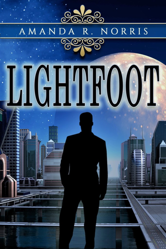
First, have a look at the original book covers, which were professionally prepared by customebookcovers.com.
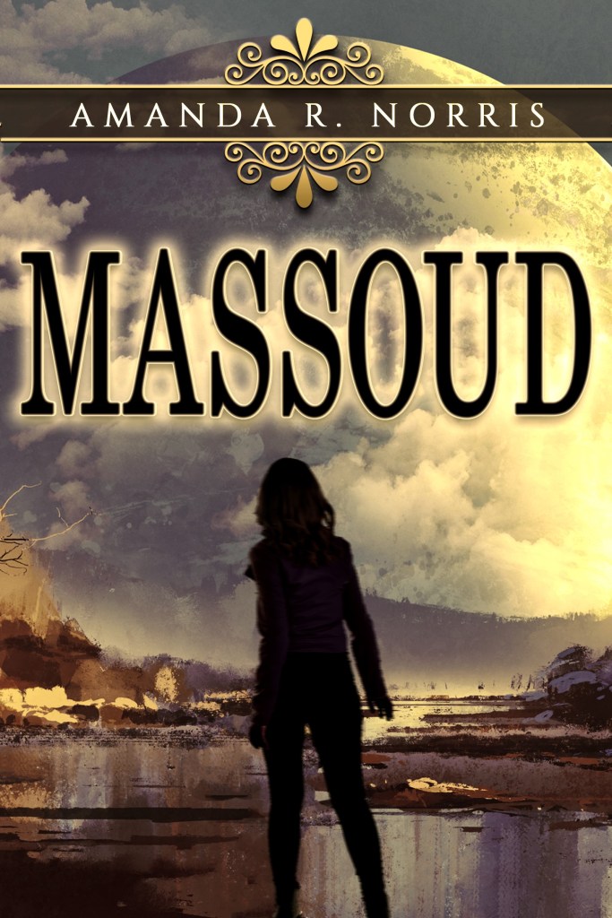

As you can see, the background images have a design that draws the eye to the center of the image (or thereabouts). The type font and scroll around the author’s name are consistent with the romance genre. However, the text does not pop to the eye, especially when the image is viewed on a small screen.
Using photo editing software, I have previously experimented with the brightness and color of these covers:

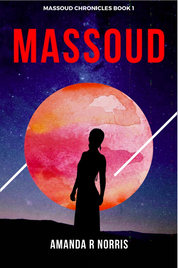
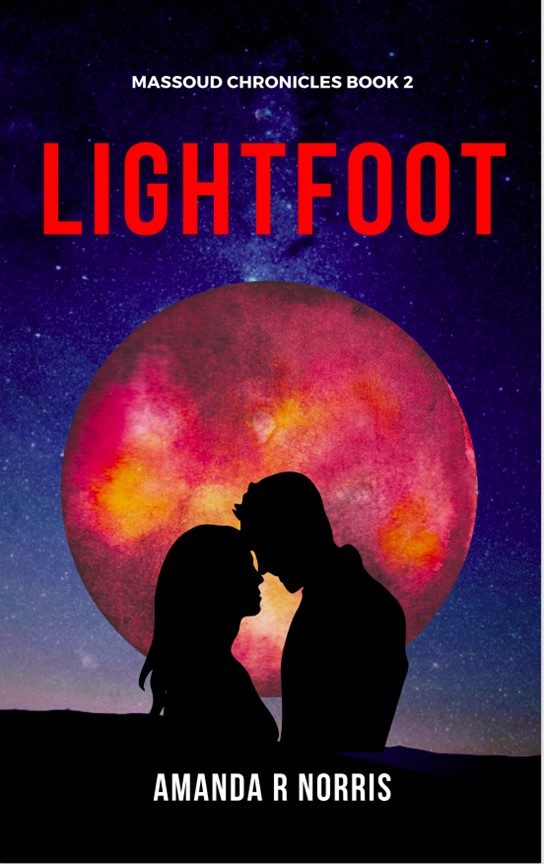
I am proposing to adopt new book covers, self-prepared using Canva.com’s design website. I started the process with a Science Fiction template. (My book series began in the Romance Space Opera genre, but I now see it migrating towards the Space Opera/Science Fiction genre.) This is the template I selected:
Making changes to the template within Canva was fairly intuitive. I restricted myself to using the cost-free elements. However, a broader range of elements (such as shapes and images) is available at a modest price. Some elements are editable, but not all.
Here are the results:
So, is it time for a change? Which set of covers appeals to you most? Let me know.
Follow The Numerate Ninny on Facebook, Instagram, Twitter, LinkedIn or at: https://thenumerateninny.com/
Find my books on Amazon platforms. And by the way, there will be a new one in April!

Personally, I like the brighter blue versions of the originals. That said, I see the appeal of the canva ones but don’t like the figures as much as the ones on the originals.
Hope that’s useful!
Gx
LikeLike
Hmm. Maybe I’ll look into finding a wider range of figures, or try a blue theme.
LikeLike